可能我有一些小小洁癖,那就是看到好看、炫酷的网页效果都会忍不住想自己也制作一份,哪怕事模仿,也必须自己手动敲一边代码。自己身边也囤积了蛮多的实例,今后我会陆续把以前写的一些CSS3和jQuery案例拿出来分享并加以注释,一方面提供给大家,一方面也算是温故而知新吧。
今天所展示的案例,主要使用到了2个CSS3属性animation和keyframes。如果大家会Flash,相信就会很容易搞懂。根据例子中的代码,我们可以这样理解:
animation:实例名称 动画时长 动画方式;
keyframes:实例名称 { 从{起始位置} 到{结束位置} };
* {margin: 0; padding: 0; outline: none;}
ul,li{ list-style:none; }
body {
background: url(bg.gif);
font: 12px normal Verdana, Arial, Helvetica, sans-serif;
color:#fff;
}
h1 {
font: 4em normal Arial, Helvetica, sans-serif;
padding:50px 0;
text-align:center;
color:#bbb;
}
.container {
width: 286px;
margin: 0 auto;
overflow: hidden;
}
.content{
width:278px;
position:relative;
font-size:12px;
line-height:2em;
padding-top:30px;
}
.col { width:286px;}
#skill li {
margin-bottom:50px;
background:#000;
height:5px;
border-radius:3px;
border-left:1px solid #111;
border-top:1px solid #111;
border-right:1px solid #333;
border-bottom:1px solid #333;
}
#skill li em {
position:relative;
top:-30px;
}
.expand {
height:1px;
margin:2px 3px;
background:#2187e7;
position:absolute;
box-shadow:0px 0px 10px 1px rgba(0,198,255,0.5);
}
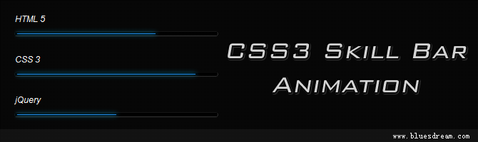
.html5 { width:70%; -moz-animation:html5 2s ease-out; webkit-animation:html5 2s ease-out; }
.css3 { width:90%; -moz-animation:css3 2s ease-out; webkit-animation:css3 2s ease-out; }
.jquery { width:50%; -moz-animation:jquery 2s ease-out; -webkit-animation:jquery 2s ease-out; }
.photoshop { width:10%; -moz-animation:photoshop 2s ease-out; -webkit-animation:photoshop 2s ease-out; }
.dreamweaver { width:100%; -moz-animation:dreamweaver 2s ease-out; -webkit-animation:dreamweaver 2s ease-out; }
@-moz-keyframes html5 { 0% { width:0px;} 100%{ width:70%;} }
@-moz-keyframes css3 { 0% { width:0px;} 100%{ width:90%;} }
@-moz-keyframes jquery { 0% { width:0px;} 100%{ width:50%;} }
@-moz-keyframes photoshop { 0% { width:0px;} 100%{ width:10%;} }
@-moz-keyframes dreamweaver { 0% { width:0px;} 100%{ width:100%;} }
@-webkit-keyframes html5 { 0% { width:0px;} 100%{ width:70%;} }
@-webkit-keyframes css3 { 0% { width:0px;} 100%{ width:90%;} }
@-webkit-keyframes jquery { 0% { width:0px;} 100%{ width:50%;} }
@-webkit-keyframes photoshop { 0% { width:0px;} 100%{ width:10%;} }
@-webkit-keyframes dreamweaver { 0% { width:0px;} 100%{ width:100%;} }
/* Info */
#info{ width:960px; margin:auto; font:13px/20px Tahoma,Arial; text-align:center;}
#info p{ text-shadow: 0 1px 0 #000; color:#BBB;}
#info a{ text-decoration:none;color:#BBB;}
请大家使用现代浏览器访问: Firefox 5+, Chrome 6+, Safari 5+
感谢您的阅读,本文由 蓝色梦想 版权所有。如若转载,请注明出处:蓝色梦想 - CSS3 Skill Bar Animation